The Power of Color: How to Choose the Right Palette
Discover the impact of color in fashion and learn how to choose the right palette to elevate your style and make a statement.
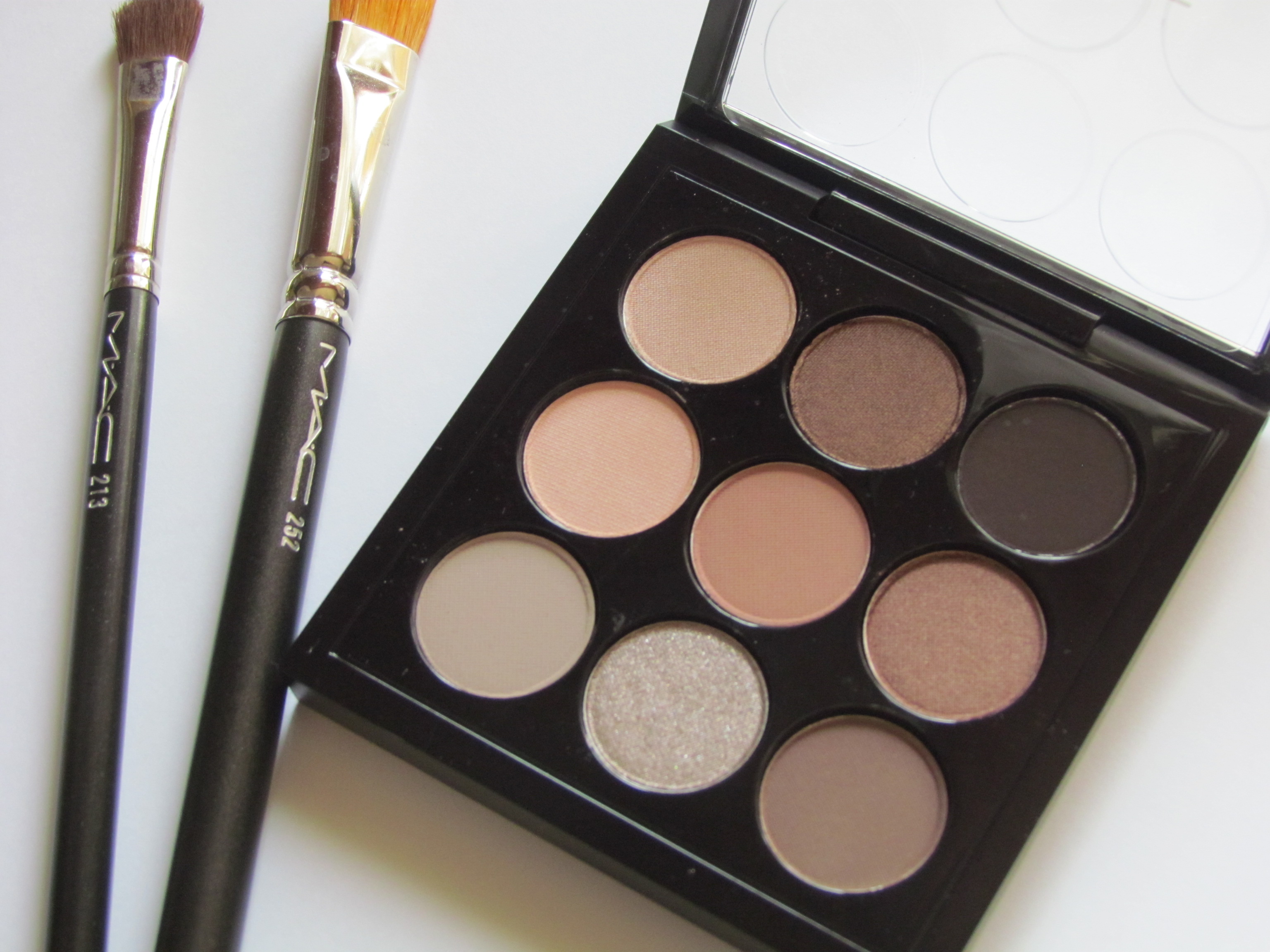
Understanding the Basics of Color Theory
When it comes to fashion, color theory is a fundamental concept that can elevate your style game. At its core, color theory involves understanding how colors interact with one another. The color wheel, consisting of primary, secondary, and tertiary colors, serves as a guide. Primary colors (red, blue, yellow) are the building blocks, while secondary colors (green, orange, purple) are created by mixing primary colors. Tertiary colors are blends of primary and secondary colors. By comprehending these relationships, you can create harmonious and visually appealing outfits. For instance, complementary colors, which are opposite each other on the color wheel, can make a bold statement when paired together. On the other hand, analogous colors, which are next to each other, offer a more subtle and cohesive look. Understanding these basics is the first step towards mastering the power of color in fashion.
The Impact of Color on Mood and Perception
Colors have a profound impact on our emotions and how others perceive us. In fashion, this means that the colors you choose can influence how you feel and how you are seen by others. Warm colors like red, orange, and yellow are often associated with energy, passion, and warmth. They can make you feel more confident and lively. Cool colors like blue, green, and purple, on the other hand, evoke calmness, tranquility, and professionalism. They are perfect for creating a serene and composed look. Additionally, neutral colors such as black, white, and gray serve as versatile staples that can balance out more vibrant hues. By being mindful of the emotional and psychological effects of colors, you can strategically choose palettes that enhance your mood and convey the desired impression.
Choosing Colors Based on Skin Tone
Selecting the right colors for your wardrobe also involves considering your skin tone. Different colors complement different skin tones, making you look more vibrant and radiant. For those with warm undertones, colors like earthy reds, oranges, and yellows tend to be flattering. People with cool undertones often look best in jewel tones such as sapphire blue, emerald green, and deep purples. Neutral undertones can generally pull off a wide range of colors but look particularly striking in shades like peach, dusty pink, and jade green. To determine your undertone, look at the veins on your wrist; if they appear more greenish, you likely have warm undertones, while bluish veins suggest cool undertones. Knowing your skin tone can guide you in choosing colors that enhance your natural beauty.
Creating a Versatile Wardrobe with a Capsule Palette
A capsule wardrobe is a collection of essential items that don't go out of fashion and can be mixed and matched to create various outfits. Choosing a cohesive color palette for your capsule wardrobe can make dressing easier and more efficient. Start with a base of neutral colors like black, white, gray, and beige. These colors are timeless and versatile, serving as the foundation for your wardrobe. Next, add a few accent colors that complement your skin tone and personal style. These could be anything from pastel shades to bold, vibrant hues. The key is to ensure that all the colors in your capsule wardrobe can be easily coordinated with one another. This approach not only simplifies your daily dressing routine but also ensures that you always look put-together.
Experimenting with Seasonal Color Trends
While having a staple color palette is essential, experimenting with seasonal color trends can add a fresh and modern touch to your wardrobe. Each season brings new color trends that can inspire your fashion choices. For instance, spring and summer often feature lighter, brighter colors like pastels and neon shades, while fall and winter lean towards richer, deeper hues like burgundy, forest green, and navy blue. Incorporating a few trendy pieces in these seasonal colors can keep your wardrobe updated and exciting. However, it's important to balance trends with timeless pieces to avoid a wardrobe that feels dated quickly. By thoughtfully integrating seasonal colors, you can enjoy the best of both worlds: a versatile, classic wardrobe with a contemporary twist.